
Promoting content on social media is one of the most effective ways of boosting site views and increasing SEO rank. After all, there are billions of accounts on Facebook, Twitter, Instagram, and other social media outlets, and they’re filled with hundreds of millions of people eager to like, comment, and share your content.
Businesses both large and small are finally taking advantage of this largely untapped source of traffic. One of the best ways to seize the opportunity is to introduce a consistent brand voice to all social media communications, including the images you post and share.
Defining and refining the brand voice can take time, as it certainly won’t happen overnight. One quick shortcut is to focus on the visual media you share across all social media accounts. By including well-sized images with subtle branding and other graphical design touches, you can establish a recognizable presence on the web that is as likely to go viral as any piece of content you produce.
The problem with visual design consistency is that not all social media sites work the same way. Some require tall images, others small, and still others awkward sizes that must be custom created. To help you get started down the right path, we’ve provided a cheat sheet below for sizing social media and Facebook images on the fly.
#Profile Picture Sizes
An account’s profile picture is its thumbnail to the world. This is what people use to judge your entire business in a fraction of a second. If it’s appealing, intriguing, you’ll gain viewership. If it’s boring, bland, or offensive, you risk the chance of losing readers.
Content of the profile picture aside, you’ll need to custom fit your image to fit the social media account’s size requirements. Simply enlarging or shrinking your graphics may produce unsightly results.
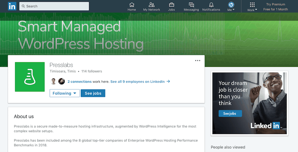
Use the sizes included in the table below when creating custom graphics for your social media accounts. It doesn’t matter which file format you use for the smaller images (.jpg, .png, .gif), but anything larger than 200 px should either be a .gif or .png.
| Profile Image | Image Size |
|---|---|
| 170 px X 170 px | |
| Google+ | 250 px X 250 px |
| 110 px X 110 px (minimum size) | |
| 400 px X 400 px | |
| Medium | 1400 px X 1120 px |
| 160 px X 160 px | |
| Tumblr | 128 px X 128 px |
| 400 px X 400 px | |
| YouTube | 800 px X 800 px (referred to as an “icons”) |
#Cover and Header Image Sizes
Once a visitor clicks on your social media account, the next piece of information they see is the cover image. Their size and style vary greatly between social media outlets, but they all serve the same purpose: communicating your brand’s style and tone of voice.
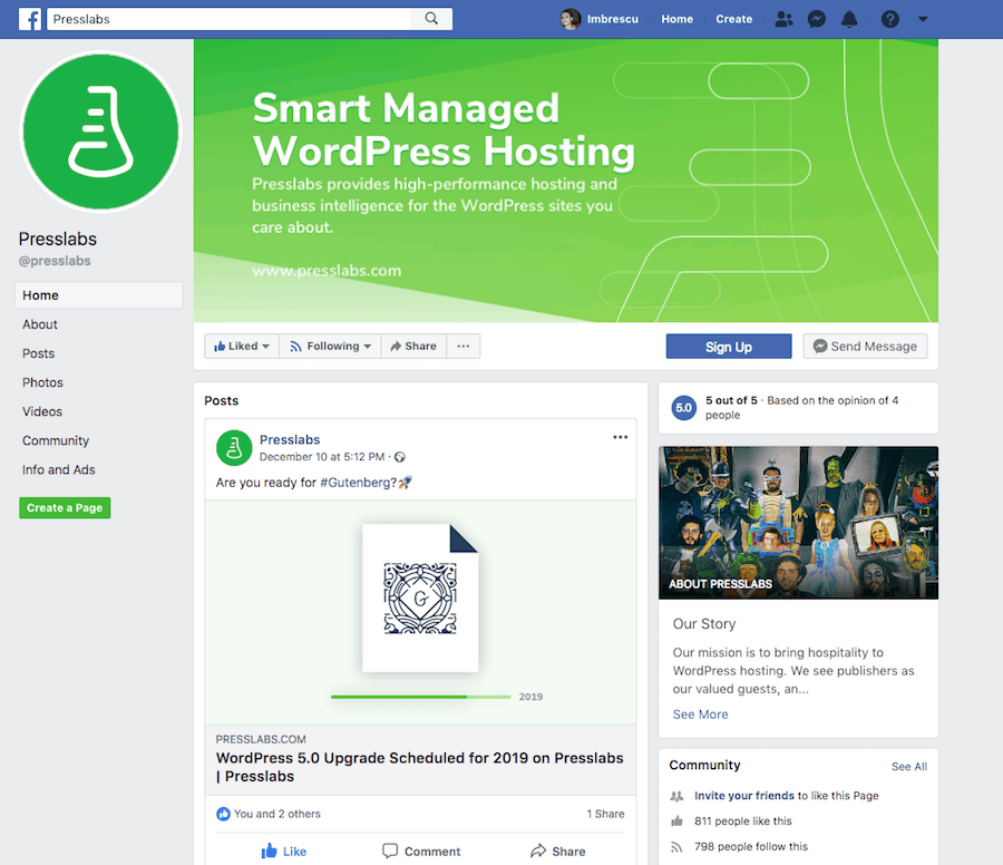
For cover images, you may want to stick with .png files, as they preserve the colors and usually display well on both desktop and mobile devices. Keep in mind that cover images are often cropped or cut off, depending on the user’s screen size and browser preference. Make sure you put all the relevant info about your brand near the center so it doesn’t get obfuscated.
| Cover Image | Image Size |
|---|---|
| 400 px X 150 px | |
| Google+ | 968 px X 545 px |
| 1536 px X 768 px (business cover image) | |
| 1584 px X 396 px (background or generic cover image) | |
| Medium | 1500 px X 750 px |
| 800 px X 800 px (board cover image) | |
| Tumblr | 3000 px X 1055 px |
| 1500 px X 500 px | |
| YouTube | varies by device, but it’s 2560 px X 1440 px on desktop |
#Images in Your Social Media Content
Social media is all about images. Text is great, and so are videos on occasion, but to really catch people’s eyes, you need attractive visuals. The bulk of your shared content should focus on pictures, graphs, charts, and anything that seems appropriate to your niche. The faster you can connect with people on social media, the better your chances of going viral.
Below are the best picture sizes for the most popular social media sites on the web. By creating images of the same ratios, you can ensure the best quality always shows up when users see your posts.
| Content Image | Image Size |
|---|---|
| 1200 px X 630 px | |
| Google+ | 502 px X 282 px (minimum, can be up to 2048 px X 2048 px) |
| 1080 px X 1080 px | |
| 1200 px X 627 px (company page) | |
| 552 px X 386 px (personal profile) | |
| Medium | 900 px wide, height doesn’t matter |
| 236 px wide, but height doesn’t matter (expanded pin images) | |
| Tumblr | 500 px X 750 px |
| 900 px X 450 px | |
| YouTube | 16:9 aspect ratio (for videos); 3840 px X 2160 px to qualify as HD |
#Shared Image Content
Are you sharing links to your site that contain images or videos? You really should, as it’s a great way to promote link building. It also alerts other outlets that you exist, increasing your reach and establishing your social media page as an expert in the industry.
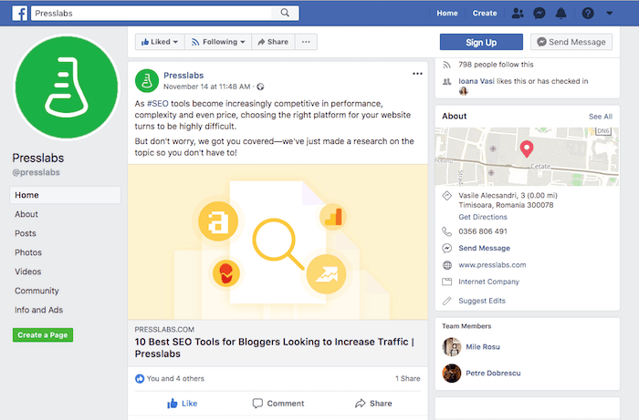
The problem with sharing images from your site to some social media networks is that they often resize them to fit different parameters or choose different images altogether. Facebook is especially prone to doing this. More often than not, images you click to share on Facebook end up looking chopped, distorted, or just plain wrong.
To counteract this, you need to make sure the social media site knows which image you’re trying to highlight each time you share a link. You can do this with Facebook by using Open Graph tags. You can also help out other social media sites by correctly optimizing images so they know which ones to scrape and display on shares.
| Shared Image | Image Size |
|---|---|
| 1200 px X 630 px | |
| Google+ | 502 px X 250 px |
| 161 px X 161 px (photo thumbnails) | |
| 436 px X 228 px (company page) | |
| 520 px X 272 px (personal profile) | |
| Medium | Will pull story header or profile image |
| 192 px X scaled height (Pin Preview); 200 px X 200 px (Board Display) | |
| 520 px X 254 px | |
| YouTube | 1280 px X 720 px (custom video thumbnail) |
