Getting a good content management system (CMS) for your website is one thing. Making sure it accurately represents your business is something else entirely.
WordPress is by far the most popular CMS on the web. It’s used by everyone from business professionals to travel bloggers, all thanks to its free and open-source nature, high level of extensibility, and most importantly, its wealth of popular and attractive themes.
Getting a good WordPress theme can make or break your online presence. Having an attractive layout does wonders to capture the attention of your prospects, but having a fast and easy-to-navigate format is what keeps them clicking and buying. Both are crucial to properly engaging with your audience, and both can be found in abundance in our favorite WordPress themes below.
#What to Look for in a Good WordPress Theme
So how exactly do you choose the best theme for your WordPress site? A lot of it has to do with personal preferences, but you might be surprised how easy it is to make a mistake. Today, we’ll be presenting several of our best recommendations, each of which scores high on the following criteria, making them fast, safe, reliable, and ideally suited for businesses of all types, from publishers to enterprise businesses:
- Style to suit your brand– Choose a theme that fits your company’s image. Stark gray grids might be perfect for a tax accountant, but if you’re in a creative industry, you’ll want something more colorful and imaginative.
- Fast loading on all devices– The longer visitors have to wait for content to load, the more likely they are to click away.
- Responsive or mobile-ready design– More people use the web on smartphones than ever before. Don’t let your business lose potential readers on the go.
- Well-built from the ground-up– You need your WordPress theme to be as solid as a rock. The only way to do this is to stick with well-made themes made by professionals.
You can easily test how a new theme affects your public website by keeping an eye on the performance stats from our dashboard.
That said here is a list of our favourite WordPress themes:
#1. Gema
Pixelgrade’s high-quality WordPress themes are some of the most functional and creative designs around. Most of them are made for bloggers and entrepreneurs who need style to complement substance. Hide the former and you lose readers, hide the latter and you lose your business. Pixelgrade makes sure you always have both. They also have a themes bundle package suited for agencies, which offers you access to all their themes to build as many websites as you need.
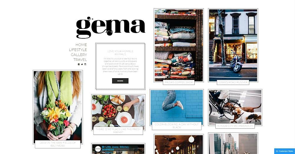
One of our favorites in Pixelgrade’s portfolio is Gema, a WordPress template described as a journal-inspired theme for wanderers who explore the world and want to share their stories.
Gema defies the traditional single column top-down blog theme. Instead of static images with text blurbs in a line, Gema mixes images of varying sizes and displays them in an active grid. Mouse over to see it come to life, then click to visit the content in question. Inside, Gema preserves the image-centric layout while lining up written content below, all in an attractive, easy-to-follow form.
Mobile browsing is shockingly gorgeous with Gema. Smartphone users won’t find the open-grid layout, instead getting a streamlined gallery-style format that presents a single post on-screen, at a time. Content is delivered smoothly as the user scrolls down, creating a warm environment that encourages visitors to explore your site.
Learn more about Gema and see it in action on Pixelgrade’s website.
#2. Noto
Noto was built for writers and creative storytellers. Its layout is a lot like a notebook, discarding the traditional rigid content format in favor of something free-flowing and organic.
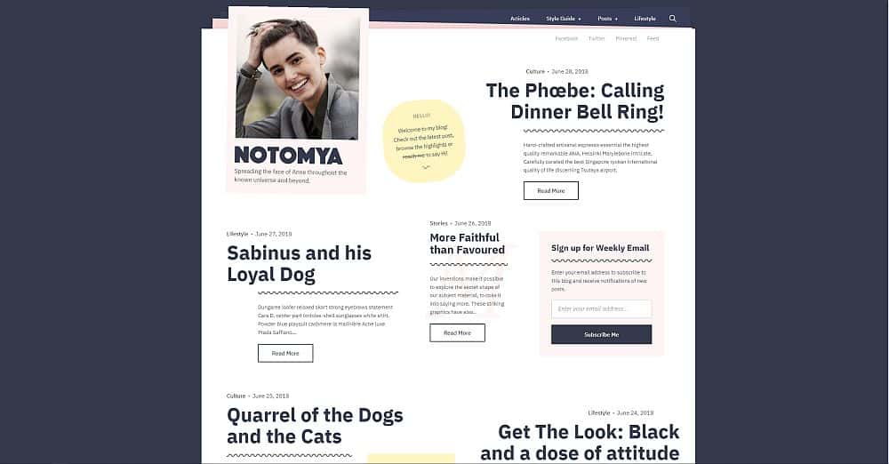
The Noto home page is a masterpiece of organized chaos. Content isn’t arranged in neat rows like most themes. Instead, it’s shown in blocks of varying sizes and shapes with eye-catching headlines in dark, bold black. Move the mouse around and these blocks spring to life with a splash of color, making it so enticing to click on readers won’t be able to resist.
Switching to the smartphone layout tidies up Noto’s format just a bit, all in an effort to make it easier to navigate on mobile devices. The wide structure is replaced by a single line of posts, though the interactive color highlights are still a strong feature.
As soon as you set eyes on Noto you’ll realize just how unique it is. See Noto in action.
#3. Vasco
Vasco is Pixelgrade’s stylish and smart WordPress theme made for serious professionals. The layout was built specifically for marketing and PR workers, public speaking trainers, and businesspeople who frequently travel. It caters to these crowds by offering a professional-looking layout that doesn’t compromise on style.
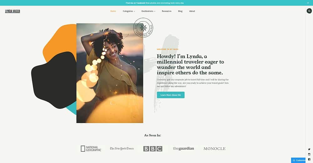
Vasco puts a short bio and welcome section right up top, allowing you to show off your skills and passions as soon as a visitor arrives. Customizable category menus wait patiently above, all of which can point to the content readers need to see most. Scroll down and Vasco presents a smart-looking grid built around themed content groups. Do you review hotels, restaurants, or products? Splash those images here and readers are sure to click through.
Vasco neatly condenses its content for mobile users, all without losing its sense of style. Everything mentioned above instantly scales down on smartphone screens, keeping all the important elements in place while showcasing each category with tap-enticing detail.
Learn more about Vasco and see it in action.
#4. The Retailer
Get Bowtied makes some stunning, visually intensive WordPress themes that somehow remain lightweight and responsive. They’re the perfect blend of modern and functional, and they do a great job representing any business on the web.
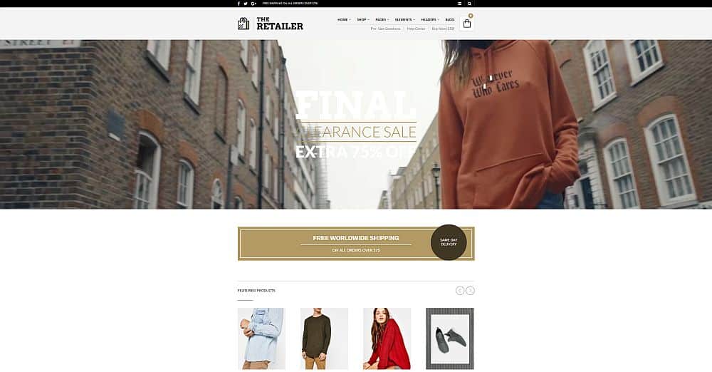
Get Bowtied’s The Retailer is a gorgeous sales-oriented WooCommerce theme that we simply love. The Retailer stays out of the way while visitors browse eye-catching products displayed with wide, attractive detail. The theme starts with a large animated video at the top, announcing in bold letters any new sales or deals of the day. Scroll down and your shop is simply there, presented with small, hover-flip images and a brief product description per item.
Straightforward, simple, but unapologetically attractive. The Retailer is one of the best WordPress WooCommerce themes to show off your products. Best of all, it’s easy to install, easy to customize, and easy to love.
Check out The Retailer by Get Bowtied.
#5. Shopkeeper
A straightforward name for a straightforward theme. The Shopkeeper template for WordPress and WooCommerce provides everything a business needs to get products online as efficiently as possible. With a quick setup and full support from Get Bowtied, anyone can grab this theme and kick-start their web business in just a few minutes.

The biggest benefit of using Shopkeeper is its extensibility. The topside menu is fully customizable to allow your company to show off its most important products and categories. Give potential customers a rundown of best-selling items, or use it to promote high-value products. Shopkeeper makes it easy to switch things around – no technical know-how required.
Take a look at the Shopkeeper demo to try it out before buying.
#6. Weta
Weta is a stark and clean magazine/e-commerce theme made by Elmastudio. The designing duo behind the blog template is known for their collection of stylish, minimalistic WordPress themes. Weta is the perfect showpiece for this, as it relies on beautiful typography, large images, and stunning amounts of whitespace to make an impression on visitors.
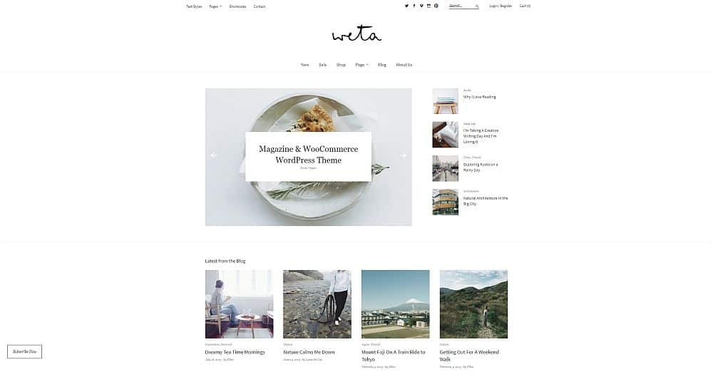
Weta opens with a large image slider that’s perfect for showing off popular content. New and featured posts are displayed below by default, with lots of unique design variations as users scroll down the home page. Opening a post reveals a straightforward blog page that puts the focus squarely on content. Just what any growing business needs to increase its customer base.
The design is responsive, meaning Weta automatically adjusts its layout attributes depending on the device a visitor views it from. Mobile readers are treated to an easily navigable stream of posts with links tucked away into a menu, while desktop readers get the full-on Weta treatment, complete with dropdown menus and fading image scrolling.
Visit Elmastudio’s Weta page to learn more about the theme and to see it in action.
#7. Zuki
Elmastudio’s Zuki theme aims for a magazine/blog style design, one that can show off your content and images without taking the focus away from the brand.
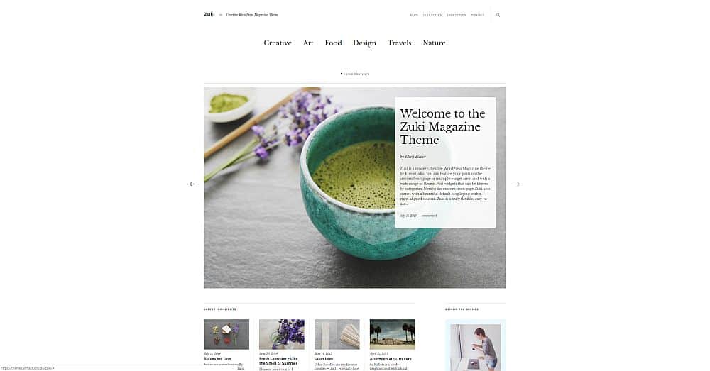
Like most themes from the same designer, Zuki sticks with a clean and pristine layout that smartly utilizes whitespace to move readers around the page. It starts with a stark category menu at the top, perfect for showing off a company’s features, an artist’s mediums, etc. Below is a wide featured spot that displays an image and text excerpt styled just like something out of a print magazine. It’s eye-catching, for sure, and it will definitely draw visitors in for more clicks.
Below Zuki’s main area is plenty of space for more blog-style content, including dozens of images with accompanying blurbs. Zuki is also a responsive theme that shifts layout styles to suit the reader’s screen. Smartphone browsers will be greeted with beautiful inline blog posts, while desktop readers get the full magazine layout, no compromises.
Check out Elmastudio’s Zuki page for more information about, or a live demo of the crisp and clean minimalist WordPress theme.
#8. Dorayaki
Business owners take note: Elmastudio’s Dorayaki theme is the prime example of how you should present your company’s content online! The layout is fast, sleek, and attractive, never sacrificing presentation in favor of content. This creates a professional yet playful look that’s so attractive, customers can’t help but stick around.
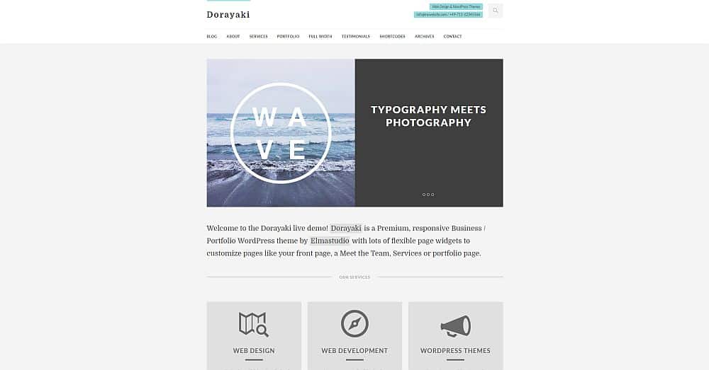
Dorayaki’s chief draw is the three-panel slider occupying the front and center of the theme. Visitors can see a quick overview of your business’s offerings without pressing a single button, making it easy to sell the company right off the bat. Just below is a bold section for an eye-catching company summary, an “about us” blurb that convinces users to keep reading.
Below the main content, Dorayaki features a grid of icons designed to showcase a company’s main offerings. Think of it as another quick summary, one that encapsulates the entirety of a business in icon format. No need to read, visitors can just scroll straight down and get the gist of what your company offers, whether it’s art, design, manufacturing, or anything in-between.
Check out the snappy, responsive Dorayaki theme on the Elmastudio web page.
#9. Felt
The Felt WordPress theme from Pixelgrade is a clean and relaxed theme that’s dead-simple to set up and customize. Its main purpose is to highlight content in a magazine-style layoutwhile showcasing an author’s ideas in a manner that connects with readers on a deeper level. Felt accomplishes this by keeping its layout simple and pristine, making it the perfect theme for all kinds of creators.
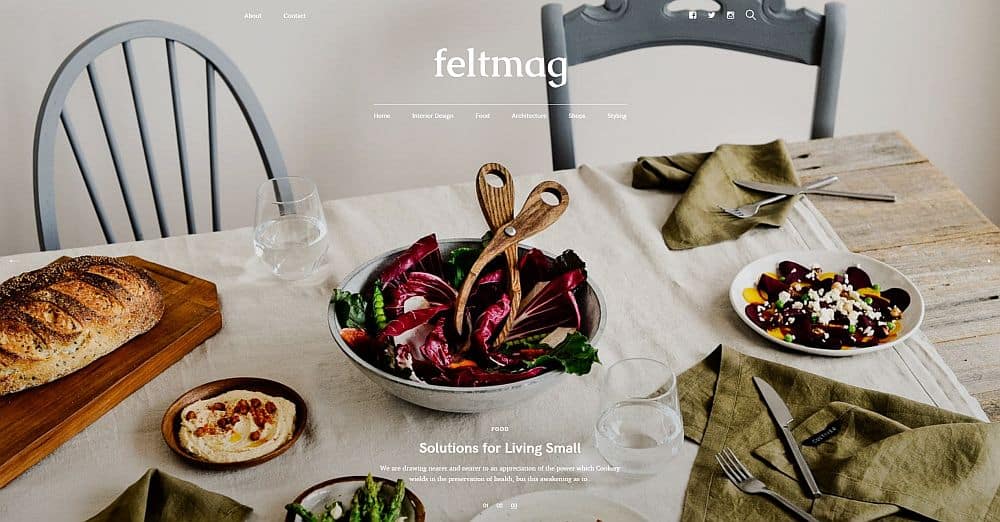
As soon as you load Felt you’re presented with a huge featured image overlaid by menu items and a post excerpt. Just below is a grid of additional content, ready to be clicked. Felt keeps the focus on unique content presentations as readers continue scrolling, delivering different sizes of grid layouts and post titles that pop off the screen.
Smartphone users get a slightly simplified version of Felt’s layout. Since there’s no room for wide magazine-style features, Felt moves everything into a straightforward column that’s easy to scroll through. Content still pops out on the small screen, so your site can still be a massive success with Felt.
Find out more about Felt and see a full interactive demo.
#Final Thoughts
Choosing the right WordPress theme isn’t an easy task. There are countless considerations, from layout and design to pure functionality. You also have to think about the purpose of the theme and whether or not it fits your brand and your goals. A lush magazine-type layout might not be the best choice for a financial advisor, for example, but a real estate broker could probably get away with it.
Any of the above themes are excellent choices for any modern digital business. Pick the one that best suits your company, fill it with smart content, then enjoy all the attention.

