#Why is web typography so important?
Although a lot of today’s web content is highly interactive and image-based, language–and thus words–is still the basic means of expression on almost every single web page. Hierarchies upon hierarchies of titles and sentences, pages, paragraphs, columns, all prove the fact that the main course of this whole feast is none other than text. And as each and every gastronomy critic knows, presentation matters, especially when it comes to your entree.
Now since the chief design language of the web is text, every web designer should first and foremost comprehend the art of typography. If you want to be successful in this domain, you’ll have to go beyond choosing a pretty looking typeface; typography means maximizing the written content’s expressiveness and this can be done–and it usually is done–irrespective of the typeface in use.
These are by and large the ideas featured in this great article on web typography that I highly encourage you to read. It basically tells us how the art of typography hasn’t changed at all in terms of its goal; typography is still all about making sure reading the text is as enjoyable as it gets.
The following is by no means a comprehensive introductory course to web typography. It is, however, an effort to create a yardstick for people who understand or want to see why text can be so beautiful and sometimes so ugly, for people who want a kick start in this field, and for those who need a stake in order to straighten their growth.
#Why a type first approach is better
Everyone is trying to make their web design responsive. It’s the new trend. Containers, images, menus, everything needs to scale to the smallest of devices in order for the consumer to have an enjoyable experience. But if you think about it, this consumer is a very specific type–he’s a reader. The number one reason he’s visiting that web page is to read the text on that page, irrespective of the device he’s reading it on. So, why should one design a web page with a particular device range in mind when he can better target what’s really important for his user?

Web typography is the backbone of almost every other web page–fact which makes it sensible to start any design with undiluted type. Not doing this may very well lead you to a point where you’ve sacrificed legibility and looks for usability.
#Type anatomy
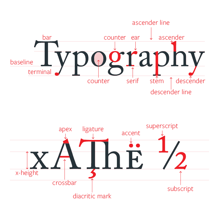
Just so you have an idea of what goes into the crafting of a typeface, here’s a comprehensive dissection of one. Each and every part is a parameter and subject to creative thinking, all the while keeping legibility to the maximum. This is why creating fonts requires mastery: your creativity is at the same type bounded and so diversified.
Some of the terms will be used in the rest of the article, but you shouldn’t worry too much about memorizing any of them.
#Type kinds
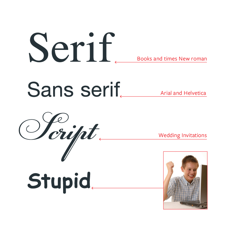
There are four basic type categories that you can choose from, each one having its own specific use cases. There’s Serif, Sans Serif or Sans, Script, and Novelty. Serifs are the classic typeface which are more formal. Sans are used in more modern and informal cases. Script and Novelty fonts shouldn’t really be used on the web as they do not emphasize readability.
#Typesetting
Typesetting is the composition of types. It’s the way they work together with their sizes and positions in order to better convey the meaning to the reader.
It’s also an art by itself, and some of its rules are mentioned in the following sections.
#Leading
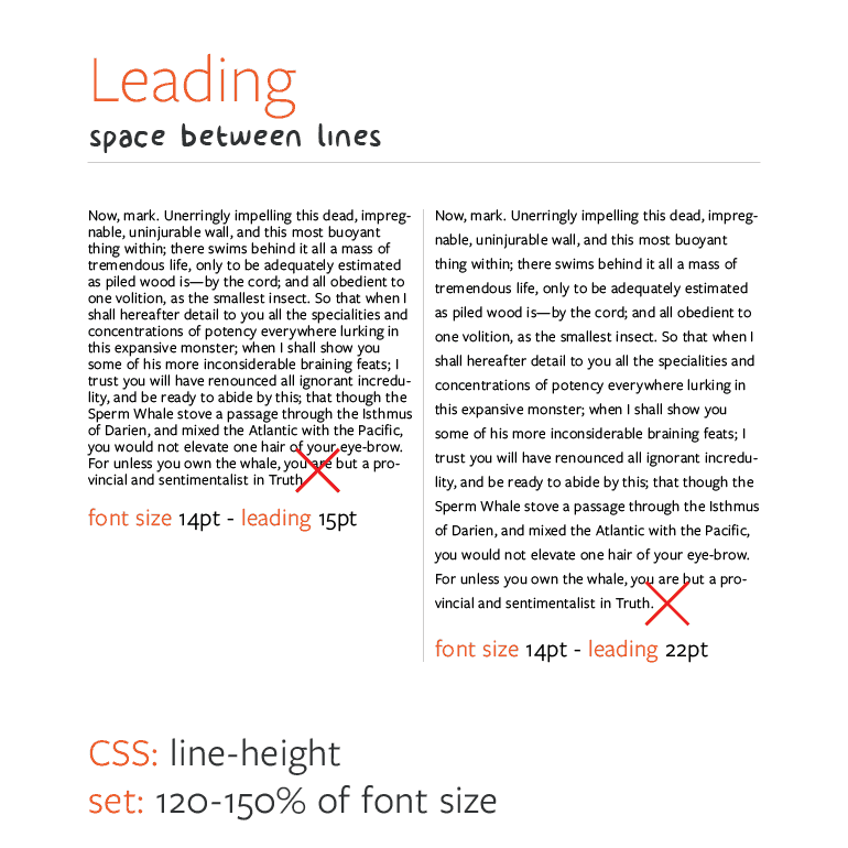
The leading is the space between baselines. The idea here is to strike the right value and stick with it. Use a leading that’s too small, and the paragraph is hard to read. Make it too large, and your reader will have a hard time jumping to the next line. Anything between 120% and 150% of the font size should work well with most typefaces.
#Measure
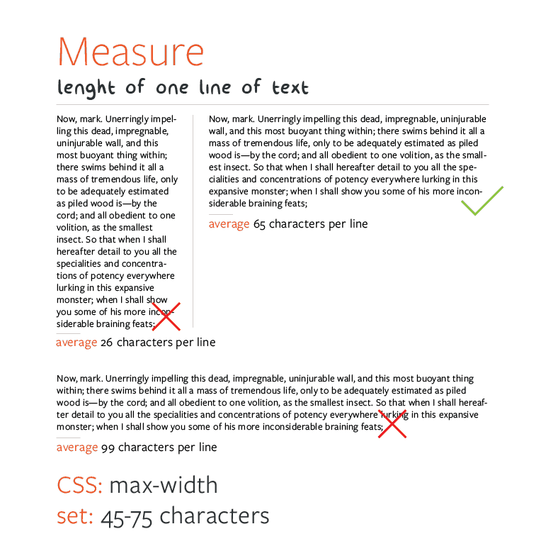
Like in the case of the leading, measure, which is the length of one line, also has a sweet spot. This sweet spot means 45-75 characters per line, a value which helps the reader keep a pleasant and natural pace while reading without being interrupted too often by line breaks or getting impatient to reach the end of the line because of its length.
#Kerning
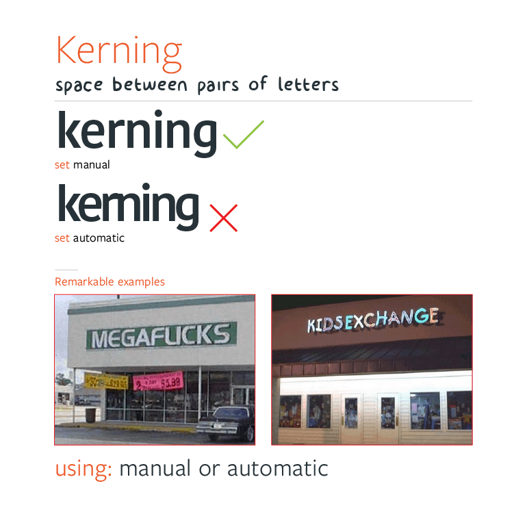
Kerning is the space between individual pairs of letters, not the general spacing between all the letters. The reason why kerning is important is that sometimes pairs of letters can work poorly together, they may overlap or look like a totally different letter. Kerning solves this problem by manually adjusting the space between such pairs in order not to convey the wrong meaning.
Below you can find some of the most iconic kerning fails and good reasons why not to forget about it when doing web design.
#Tracking
Tacking is the space between all letters, and it’s another area where you can vastly improve legibility in some particular cases. It’s also usually one of the differentiators between good typography and great typography.
![]()
#Alignment
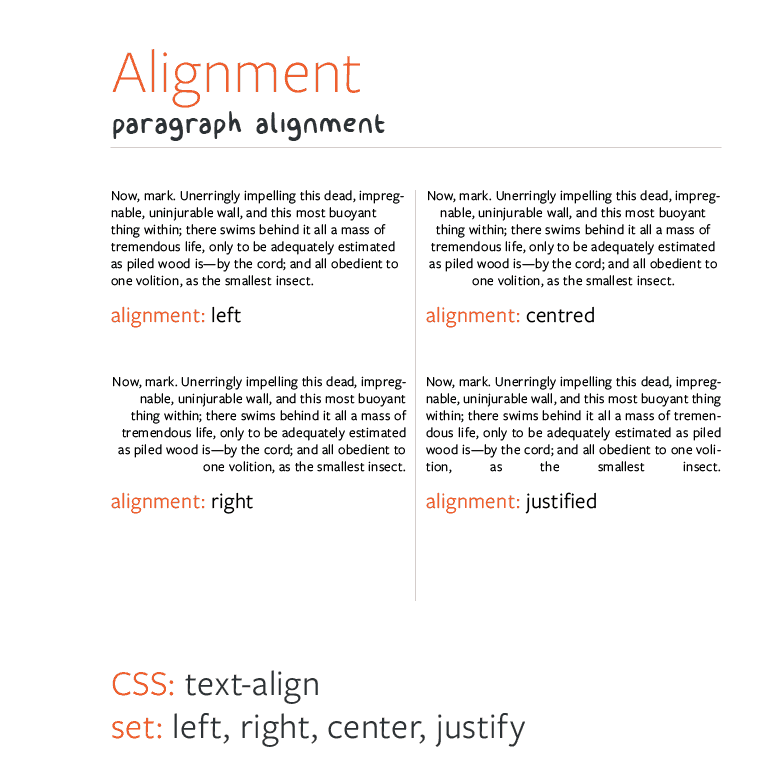
The alignment of text helps a lot in the structure of a web page. Almost every modern web page uses at least two or three different alignment styles to enhance its structure. For example, you can align a big heading to the right, the grid-based text should be centered, and usual paragraphs can be left-aligned or justified.
#Size
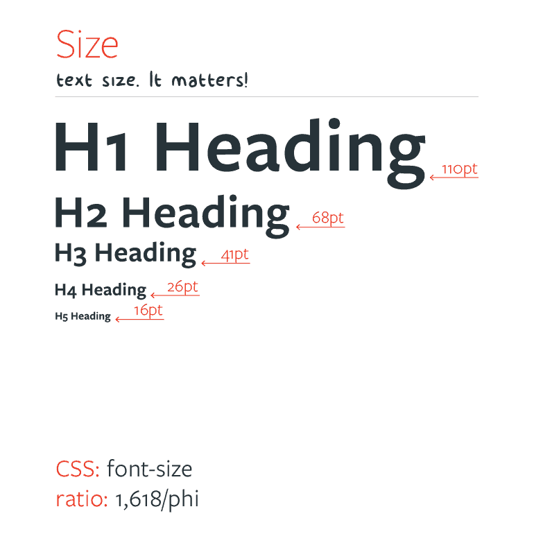
Every web page should have a set of text sizes to work with. Getting these values to work well together is not an easy thing, but an idea might be to use the golden ratio between consecutive sizes with manual adjustment where necessary.
A natural and pleasing size variation will make a web page beautiful on its own while keeping everything nice and legible.
#Capital sins of type setting
- Text sizes
- Lazy handling of titles and subtitles
- Text blocks that are not split up into enough small, scannable, digestible parts
- Indiscernible links
- Text is not treated as an interface but as decoration
- Fancy navigation drawing the attention from the actual content
- Lack of active white space
As you can see, typesetting can make or break a web page, but if you get it right, you’ve got solid ground to build upon.
#How to choose fonts
Choosing a font for a specific task can be a hard thing to do. Each and every font communicates in a different manner and tells the story in its own voice.
#The webfont jungle
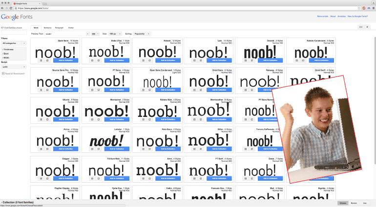
A good place to start from can be a webfont library. They’re really easy to integrate, they don’t cost a fortune (and thus aren’t an investment that can go way wrong), and they’re absolutely varied. This is why you can’t go wrong with such a library, and why it’s so handy to people who aren’t fully invested in the art of typography.
On the other hand, one may get overwhelmed in this jungle of fonts and do a complete rainbow-like combination for a website. That is not the purpose. Typography is a temperate art, an art of elegance.
#What to do?
Here are a few practical tips for starting with a webfont library.
- Don’t get overwhelmed
- Keep it simple
- Rely on quality fonts
- Create your own palette
- Privilege workhorses and super-families
- Prepare some text and read it–do you like what you see?
- Ask for a second opinion
#Workhorses and super-families
When it comes to fonts, workhorses are all the rage. They’re like the AK47s of typefaces. No matter how bad the conditions may be, they will still do their job and look elegantly doing it.
They’re great also because they come in a huge variety of weights and styles (bold, italic etc.) which rids you of the daunting task of finding good-looking font combinations; you can improve variety by playing with the weights and styles while also knowing for sure that they fit together perfectly.
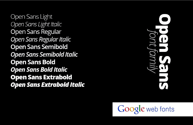
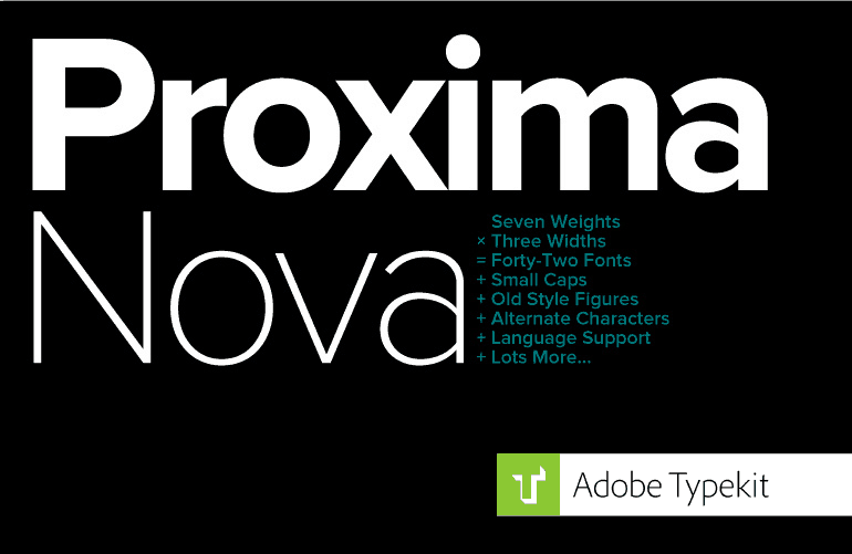
Here are two of the most popular webfont workhorses. They are so varied and complete that you can create not only a whole website with them but a whole brand identity around them. Open Sans is available for free on Google Fonts, while Proxima Nova requires an Adobe Typekit subscription.
